Improving Finance Management for Freelancers
Overview
Imagine spending 30 minutes every weekend manually compiling different receipts, cross-referencing bank statements, and color-coding cells you'll inevitably mess up next month. It's objectively time consuming for independent businesses, but when asked if they'd consider switching to something convenient, most people say: "Not really." Across our research with microbusiness owners, we discovered people had built deep trust in their existing systems–no matter how inefficient. Quicken Simplifi was preparing to launch new features for project management and taxation support and my task was to understand how can we improve adoption of Quicken Simplifi among freelancers and microbusiness owners.Role
UX Researcher
I led interviews and recruitment for research with microbusiness owners. I also facilitated analyzing research findings and synthesizing insights.
Timeline
Jan 2024 - May 2024 (4 months)
Team
Aman Rawat
UX Researcher
Carl Fan
UX Researcher
Rushal Butala
UX Researcher
Shujun Li
UX Researcher
Mo Ibrahim
Senior Product Manager
Tara Pugh
Senior Product Designer
Skills
Stakeholder Interviews, User Research, Competitive Analysis, Heuristic Evaluation, Usability Testing
My Contributions
As a UX Researcher, I...
- Led stakeholder interviews to align on business goals and constraints
- Recruited and conducted semi-structured interviews with microbusiness owners
- Facilitated competitive analysis and heuristic evaluations of Quicken Simplifi's beta product
- Led usability testing sessions to identify adoption barriers
- Synthesized research findings across multiple methods using affinity mapping
Outcome/Impact

Presented actionable recommendations for improving usability, navigation, and user trust

Positive reception, with plans to implement streamlined dashboards
Background
Quicken Simplifi is positioned as an affordable solution for freelancers and microbusinesses – for people positioned between personal finance apps and full-fledged enterprise solutions. The value proposition was clear: separating personal and business finances, simplifying workflows, and providing real-time financial insights.Problem statement
As Quicken was gearing for the launch of their new features – project management and taxation support – the simplifi team wanted us to investigate how microbusiness owners currently manage their finances, and identify pain points in their workflows to provide a set of recommendations to improve adoption of Quicken Simplifi. With this our starting point was:How might we improve the adoption of Quicken Simplifi by the freelancer and microbusiness community?
Interviews
What our stakeholders had to say
We want to specifically target the users that use Excel and not Quickbooks, as we believe that they are the ones who are looking for a simpler solution to manage their financesI conducted interviews with the 2 key stakeholders – the Senior Product Manager and Senior Product Designer. The goal was to understand their vision for the product and business goals. This set the foundation for the user base I wanted to focus on and the competitors I wanted to analyze.
What our users had to say
I recruited 5 microbusiness owners (1-10 employees) around Ann Arbor and conducted semi-structured interviews of around 30 minutes each to understand their current finance management workflows, pain points, needs and attitudes towards technology. These are some of the key findings I uncovered:Finding #1: Trust in existing systems
Users had built deep trust in their current tools, not because they were good, but because they were known. They understood how errors happened, knew how to fix them, and had built relationships (with friends, accountants, bookkeepers) around these systemsFinding #2: Privacy concerns with new tools
Connecting bank accounts to third-party applications raised significant concerns. Users valued complete control over their financial data and were hesitant to grant access, even if it meant more convenience, especially since their traditional systems like Excel offered them that control.Finding #3: Comfort with the familiar
Users had developed muscle memory and workflows around their current systems. Even if those workflows were inefficient, they were predictable. The cognitive cost of learning something new outweighed the promise of future efficiency.Analytical Phase
Competitive Analysis

Quicken's strongest selling points were its affordability and number of features. However, I conducted the analysis with a focus on Pricing, Ads (to address concerns around privacy), Onboarding Guide (for ease of learning), and Customizability (to address comfort with familiar systems). Quicken fell short in onboarding and customizability compared to its competitors – which had comprehensive onboarding guides and templates to customize personally and address the learning curve.
Heuristic Evaluation
 Using Nielsen's 10 usability heuristics, I evaluated Quicken Simplifi's beta product against 9 of the heuristics to identify friction points that might prevent users from reaching the project management and taxation features. Critical Issues I uncovered included:
- Inconsistent Layout and Interaction: Users couldn't build a mental model because the system's layout did not fit with the users' expectations. For example, there were variations in design styles of section like "Goals" when accessed from different parts of the app.
- Lack of Confirmation for Critical Actions: Deleting a transaction had no confirmation dialogue. Saving an invoice sometimes showed an error but saved anyway. Users couldn't trust what the system was doing.
- Hidden Navigation for Key Features: The tax reporting section was buried three levels deep. Project management lived in a different area entirely
- Redundant Classification Systems: The system had tags, categories, and flags–all doing similar things. Users couldn't distinguish between them, leading to inconsistent data organization.
What our usability tests revealed?

- Set up a new project and track billable hours
- Generate a tax report for quarterly review
- Create a recurring invoice for an existing client
Recommendations

Simplify Language and Layout:
- Use color coding for income/expenses
- Add tooltips for complex features
- Ensure all navigation elements are visible without scrolling
- Incorporate a search bar for easy access
Persona-Driven Features:
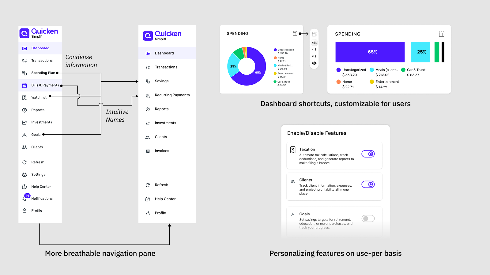
- Enable users to customize dashboards based on their preferences, add/remove features based on their workflow
- Highlight high-demand features like taxation during tax season in more accessible locations
Shortcuts for Navigation:
- Introduce modular cards for customizable dashboards
- Allow users to create personalized shortcuts for frequent tasks
